Rows: 108 Columns: 4
── Column specification ────────────────────────────────────────────────────────
Delimiter: ","
chr (2): level, type
dbl (2): start_year, no_of_students

ℹ Use `spec()` to retrieve the full column specification for this data.
ℹ Specify the column types or set `show_col_types = FALSE` to quiet this message.
Data Analysis
1. What are the most common types of SEN students?
Creating dataframe for total number of primary students over the years
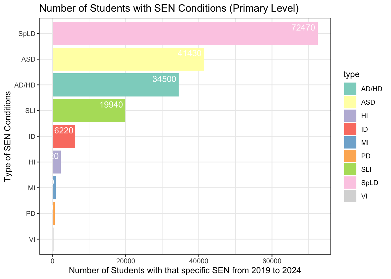
# Creating a dataframe for total primary SEN students ccp <- df |>filter(level =="Primary") |>group_by(level, type) |>summarise(n =sum(no_of_students), .groups ='drop') |>arrange(desc(n))head (ccp)
# A tibble: 6 × 3
  level   type      n
  <chr>   <chr> <dbl>
1 Primary SpLD  72470
2 Primary ASD   41430
3 Primary AD/HD 34500
4 Primary SLI   19940
5 Primary ID     6220
6 Primary HI     2220
Creating a bar graph
# Creating a bar graph based on previously filtered datasetlibrary(ggplot2)library(forcats)ccp |>ggplot(aes(x =fct_reorder(type, n), y = n, fill = type)) +geom_col() +labs(title ="Number of Students with SEN Conditions (Primary Level)",x ="Type of SEN Conditions",y ="Number of Students with that specific SEN from 2019 to 2024") +theme_bw() +coord_flip() +geom_text(aes(label = n), vjust =-0.5, hjust =1.1, color ="white") +scale_fill_brewer(palette ="Set3") # Choose a color palette
The downloaded binary packages are in
    /var/folders/ws/7cptw1bn6zg08wbvmf213h280000gn/T//RtmpJF1pdg/downloaded_packages
# Loading patchwork packagelibrary(patchwork)
Creating dataframe for total number of secondary students over the years
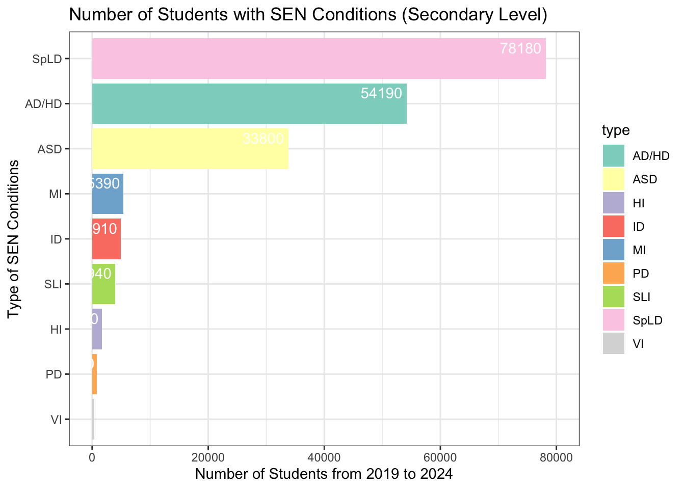
# Creating a dataframe for total secondary SEN sutdents ccs <- df |>filter(level =="Secondary") |>group_by(level, type) |>summarise(m =sum(no_of_students), .groups ='drop') |>arrange(desc(m)) head(ccs)
# A tibble: 6 × 3
  level     type      m
  <chr>     <chr> <dbl>
1 Secondary SpLD  78180
2 Secondary AD/HD 54190
3 Secondary ASD   33800
4 Secondary MI     5390
5 Secondary ID     4910
6 Secondary SLI    3940
Creating a bar graph
# Creating a bar graph based on previously filtered datasetlibrary(ggplot2)library(forcats)ccs |>ggplot(aes(x =fct_reorder(type, m), y = m, fill = type)) +geom_col() +labs(title ="Number of Students with SEN Conditions (Secondary Level)",x ="Type of SEN Conditions",y ="Number of Students from 2019 to 2024") +theme_bw() +coord_flip() +geom_text(aes(label = m), vjust =-0.5, hjust =1.1, color ="white") +scale_fill_brewer(palette ="Set3") +scale_y_continuous(limits =c(0, 80000)) # Set y-axis limits
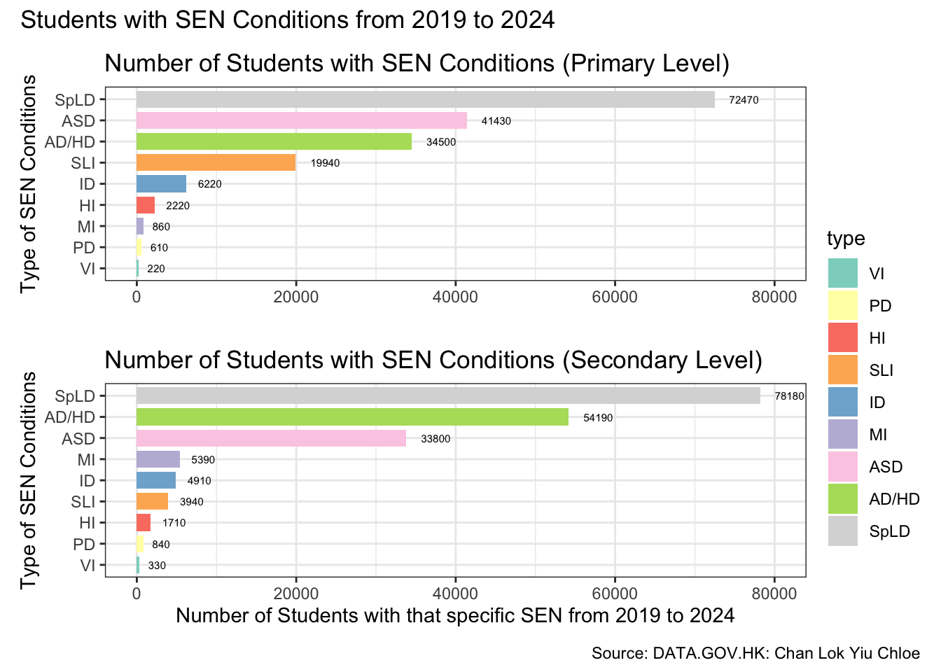
Merging the primary and secondary bar graphs to showcase the most common types of SEN student
# Merging two bar graphs togetherlibrary(ggplot2)library(forcats)library(patchwork)## Calculate the order for the primary level graphtype_order <- ccp |>group_by(type) |>summarise(total =sum(n)) |>arrange(total) |>pull(type)# Set factor levels for primary data frameccp$type <-factor(ccp$type, levels = type_order)# Calculate the order for the secondary level graph based on the same total countsccs_order <- ccs |>group_by(type) |>summarise(total =sum(m)) |>arrange(total) |>pull(type)# Set factor levels for secondary data frameccs$type <-factor(ccs$type, levels = ccs_order)## Define color palette using Set3color_palette <- RColorBrewer::brewer.pal(n =length(type_order), name ="Set3")# Create a named vector for consistent color mappingcolor_mapping <-setNames(color_palette, type_order)## Primary Level Graph without legendp1 <- ccp |>ggplot(aes(x = type, y = n, fill = type)) +geom_col(width =0.8) +labs(title ="Number of Students with SEN Conditions (Primary Level)",x ="Type of SEN Conditions",y =" ") +theme_bw() +coord_flip() +geom_text(aes(label = n), vjust =0.5, hjust =-0.5, color ="black", size =2) +# Text outside the barscale_fill_manual(values = color_mapping, guide ="none") +# Use consistent color mappingscale_y_continuous(limits =c(0, 80000)) # Set y-axis limits # Secondary Level Graphp2 <- ccs |>ggplot(aes(x = type, y = m, fill = type)) +geom_col(width =0.8) +labs(title ="Number of Students with SEN Conditions (Secondary Level)",x ="Type of SEN Conditions",y ="Number of Students with that specific SEN from 2019 to 2024") +theme_bw() +coord_flip() +geom_text(aes(label = m), vjust =0.5, hjust =-0.5, color ="black", size =2) +# Text outside the barscale_fill_manual(values = color_mapping) +# Use consistent color mappingscale_y_continuous(limits =c(0, 80000)) +# Set y-axis limitstheme(legend.position ="right", legend.box ="vertical", legend.margin =margin(t =-100)) # Adjust top margin to move legend higher ## Combine the plots with a shared legend and add a captioncombined_plot <- p1 + p2 +plot_layout(ncol =1) +plot_annotation(title ="Students with SEN Conditions from 2019 to 2024", caption ="Source: DATA.GOV.HK: Chan Lok Yiu Chloe")combined_plot
ggsave("bar_ps_graph.png")
Saving 7 x 5 in image
2. When did the number of SEN students begin to increase rapidly?
Creating dataframe for primary SEN students over the years
# Creating a dataframe for numbers of primary SEN students over the years pri <- df|>filter(level =="Primary") |>count(type, start_year, no_of_students)head(pri)
Creating dataframe for secondary SEN students over the years
# Creating a dataframe for numbers of secondary SEN students over the years sec <- df|>filter(level =="Secondary") |>count(type, start_year, no_of_students)head(sec)
Interactive line graph to explain when the number of Secondary SEN students began to increase
# Interactive line graph for the number of secondary SEN students from 2019-2024library(ggplot2)library(dplyr)library(plotly)
Attaching package: 'plotly'
The following object is masked from 'package:ggplot2':

    last_plot
The following object is masked from 'package:stats':

    filter
The following object is masked from 'package:graphics':

    layout
library(RColorBrewer)library(colorspace) ## Count the number of SEN students by year and typedata <- pri |>count(start_year, no_of_students, type)## Define color paletteoriginal_palette <-brewer.pal(n =length(unique(data$type)), name ="Set3")darkened_palette <-darken(original_palette, amount =0.3) ## Create the line graph with ggplot2p <-ggplot(data, aes(x = start_year, y = no_of_students, color = type, group = type)) +geom_line(size =1, linetype ="dotted") +geom_point(size =2) +scale_color_manual(values = darkened_palette) +labs(title ="Number of Primary SEN Students by Type and Year",x ="Year",y ="Number of SEN Students") +theme_bw() +theme(legend.position ="right")
Warning: Using `size` aesthetic for lines was deprecated in ggplot2 3.4.0.
ℹ Please use `linewidth` instead.
## Convert ggplot to an interactive plotly graphinteractive_plot1 <-ggplotly(p, tooltip =c("start_year", "no_of_students", "type"))# Add caption to the plotinteractive_plot1 <- interactive_plot1 %>%layout(annotations =list(text ="Source: DATA.GOV.HK: Chan Lok Yiu Chloe",x =1.1,y =-0.12,xref ='paper',yref ='paper',showarrow =FALSE,font =list(size =10) ) )# Show the interactive plotinteractive_plot1
Interactive line graph to explain when the number of Secondary SEN students began to increase
library(ggplot2)library(dplyr)library(plotly)library(RColorBrewer)library(colorspace) ## Count the number of SEN students by year and typedata <- sec |>count(start_year, no_of_students, type)## Define color paletteoriginal_palette <-brewer.pal(n =length(unique(data$type)), name ="Set3")darkened_palette <-darken(original_palette, amount =0.3) ## Create the line graph with ggplot2p <-ggplot(data, aes(x = start_year, y = no_of_students, color = type, group = type)) +geom_line(size =1, linetype ="dotted") +geom_point(size =2) +scale_color_manual(values = darkened_palette) +labs(title ="Number of Secondary SEN Students by Type and Year",x ="Year",y ="Number of SEN Students") +theme_bw() +theme(legend.position ="right")## Convert ggplot to an interactive plotly graphinteractive_plot2 <-ggplotly(p, tooltip =c("start_year", "no_of_students", "type"))## Add caption to the plotinteractive_plot2 <- interactive_plot2 %>%layout(annotations =list(text ="Source: DATA.GOV.HK: Chan Lok Yiu Chloe",x =1.1,y =-0.12,xref ='paper',yref ='paper',showarrow =FALSE,font =list(size =10) ) )## Show the interactive plotinteractive_plot2